The Bendigo Library in Victoria was built in 1983, a two storied structure that serviced the community and was home to the Goldfields Library Corporation for the next thirty years. However, it had become dated in the time that passed, underwhelming in the current day expectations for its civic presence and poorly integrated with the adjoining public park and streets.
Winning the public tender for the site’s redevelopment three years ago, MGS Architects were tasked with presenting a new contemporary language for the building, although in an accent that remained referential to the adjacent heritage Town Hall.
A bold use of colour is one element that was employed to reanimate the building, applied astutely and in a restrained way over a masonry façade to complement the surrounding civic spaces. The chosen palette works with the design and materials to create a newfound dynamism for the building, enhanced by the dancing interplay of light and shadow found throughout the site.
Since the upgrade, over 55,000 people have passed through each month, an increase of over 25 per cent, while the number of new members has increased by a staggering 225 per cent. With renewed links to Town Hall and the retail precinct, the library has become a new place for the exchange of ideas and interaction within the community, a flexible and inclusive hub for the City of Bendigo.
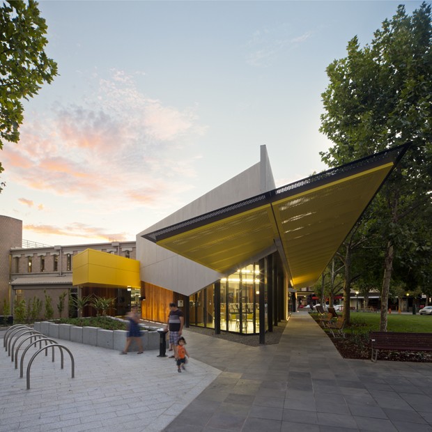
A convincing design strategy does not always come easily for a sensitive redevelopment of a historically significant site. To meet this end, MGS Architects started the project working with the spatial elements they already had in the existing building. Taking visual cues from nearby buildings, the new northern and western façade is constructed with precast concrete panels laid in a staggered brick pattern, referential of stone masonry of the past.
This facade is punctuated by a Vitrapanel Façade System coated in Dulux ‘Limone’ at the two street entrances, and balanced by Woodform Architectural Dressed Spotted Gum. Bamstone Bluestone Pavers lead the way into, through and out of the library, upgrading the exterior park interface.
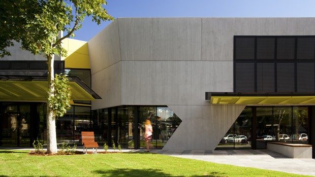
Dulux's ‘Limone’ is a greenish-yellow colour that speaks to Bendigo’s years past, as well as the adjacent Town Hall’s heritage golden beige twinge – a call out which ensures the building’s facelift is not jarring, but maintains a connection with its landscape. In contrast, the monumentality of the modern day stone – precast concrete – reinforces the library’s new contemporary use and civic aspirations.
A sub text of contemporary art has also influenced the façade design, with the black powder coated perforated panels that sweep across the concrete façade paying homage to abstract French artist Pierre Soulages’ large, black brush strokes.
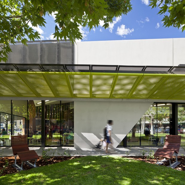
Another highlight are the canopies layered in front of the building, partially chosen to shelter the glass frontages for environmental reasons, but also to tell the story of the heritage canopies that framed the front of old Victorian shops in Bendigo. Supplied by the Locker Group, these canopies are finished in Dulux’s ‘Limone’ and ‘Black’ – the former intermingling with the greens of the park beyond, and the latter making a visual connection to the double-glazed powder coated curtain walls in black to the lower sections of the facade.
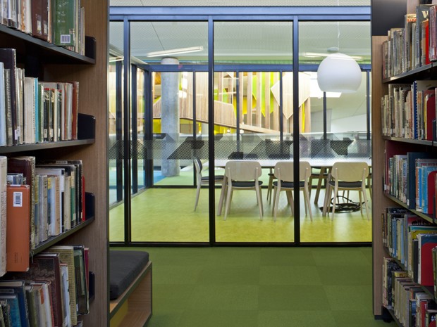
These layered metal canopies have created a ‘moiré’ effect, with their perforations allowing trickles of sunlight to shine through, casting pixelated shadows of tree canopies on to the ground plane below. The introduction of light, shadow and movement builds up a relaxed atmosphere for visitors, with the whole ground plane shimmering when the wind blows. High levels of transparency are achieved with the glass panes, offering visual connections to the park and a welcoming interface to the wider Bendigo community. AWS Commercial SERIES 636 Double Glazed FrontGLAZE™ is used to frame the external glazing and 400 Single Glazed CentreGLAZE™ for internal glazed floor to ceiling windows and doors.
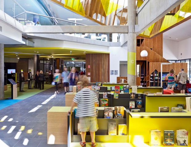
The play of light is also used in the interior of the building, providing connections with both the exterior as well as between the upper and lower floors. This has helped to reconfigure the older library, which had poor connections between the different areas of use.
A key focus for the design team was to reinvigorate the ‘partially completed’ hexagonal atrium, redefining it as the building’s new community heart. This area now features a bluestone internal street that leads through the building and past various destination activities. Laminex's Neon, Sublime Teak and Charcoal were used for the joinery to ‘retail’ the library’s books; the colours and textures complementing the existing muted whites and greys, and challenging the traditional concept of a silent, inactive and ‘boring’ library.
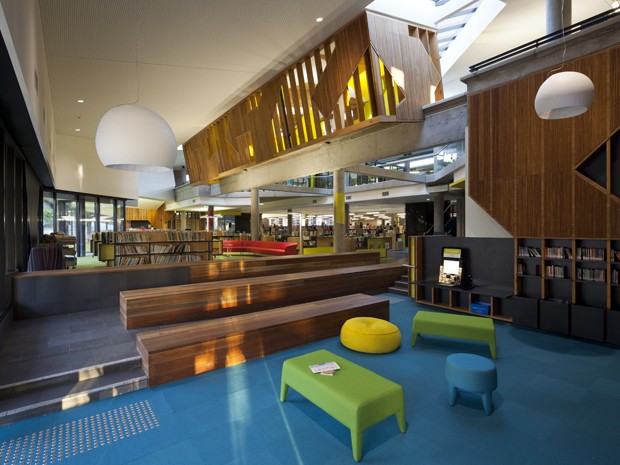
The children’s library is one of the main attractions of the new development, with many of the design gestures (bright colours, broad textured strokes of timber veneer referencing Pierre Solanges) simultaneously echoing and leading up to this playful and fun space. Key pieces of loose furniture from Jardan and Stylecraft are covered in Kvadrat Maharam fabrics, while the workplace furniture is from Baseline.
The majorityof the internal lighting fixtures for the library are from Zumtobel’s Tecton, Credos, Panos, and Vivo Series, while Hub Furniture’s Celine Wright ¾ Spheres were used intermittently to enhance the design of specific meeting rooms, and in the case (image) above, the children’s library.
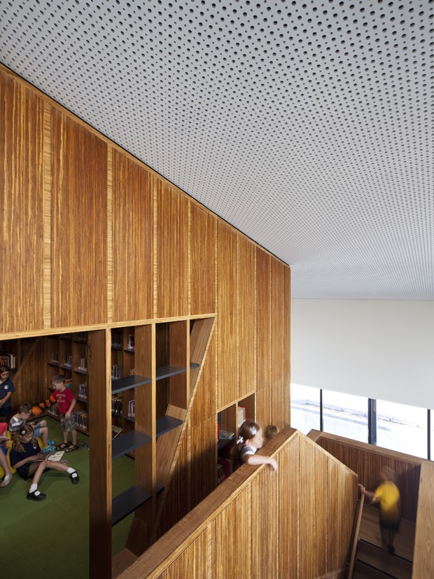
The Italian timber Doll Chairs manufactured by Billiani and imported by Insitu provides a connection with the bamboo veneer cladding the ‘lantern’, which picks up the shape of the partial hexagonal atrium. Made from Leto Bamboo’s ‘Strand Woven’, this ‘lantern’ is further transformed with the inclusion of Solar Yellow Perspex by Mitchell Plastics, and mirror veneers. The ‘lantern’ has been designed as a kaleidoscope of light and colour, with the passing light of the day coming through and bouncing off the lantern surfaces, so that when visitors look up at it, they can either see through it, or see their own reflections.
Knauf's Cleaneo plasterboard in an Alternating Circular Pattern forms the bulk of the library’s acoustic treatment, which project architect Joshua Wheeler says is possibly the biggest installation of the product in Victoria, if not Australia. Here, the plasterboard’s perforations recall the perforated metal canopies featured externally, as do the Dressed Spotted Gum by Woodform Architectural. Woven Image's Echopanels in Black were also used in the internal ceilings and walls to improve the building’s acoustic performance.
Despite the span of activities encompassed within the library, from a café, lounge, and theatre, to study and meeting areas, reading rooms and offices, the repeated use of linchpin elements successfully brings all these spaces together. In addition to the considered and consistent colour selections, timbers and perforated patterns, Kingfisher bookshelves, Whitecliffe Imports Carpet Tiles and Forbo’s Marmoleum ‘Real’ resilient flooring in Blue and Chartreuse are some of the other products that allow the 4,000sqm library to be read as a grand house with civic aspirations and many rooms for all.
Photography by Andrew Latreille
